Streamlined Webex Checkout for SMB Growth
Mar 2023
Team

Product Manager Lead
Product Manager
Web-SMB-Specific Engineering Team
My Role

Research & Product Strategy, User flows, Interaction and Visual Design
Time Line

3 months
Catalog
Pain Points
Business goal
Target audiences
Competitive Research
Solutions & Proposals
North Star
Challenges
Outcome
Pain Points
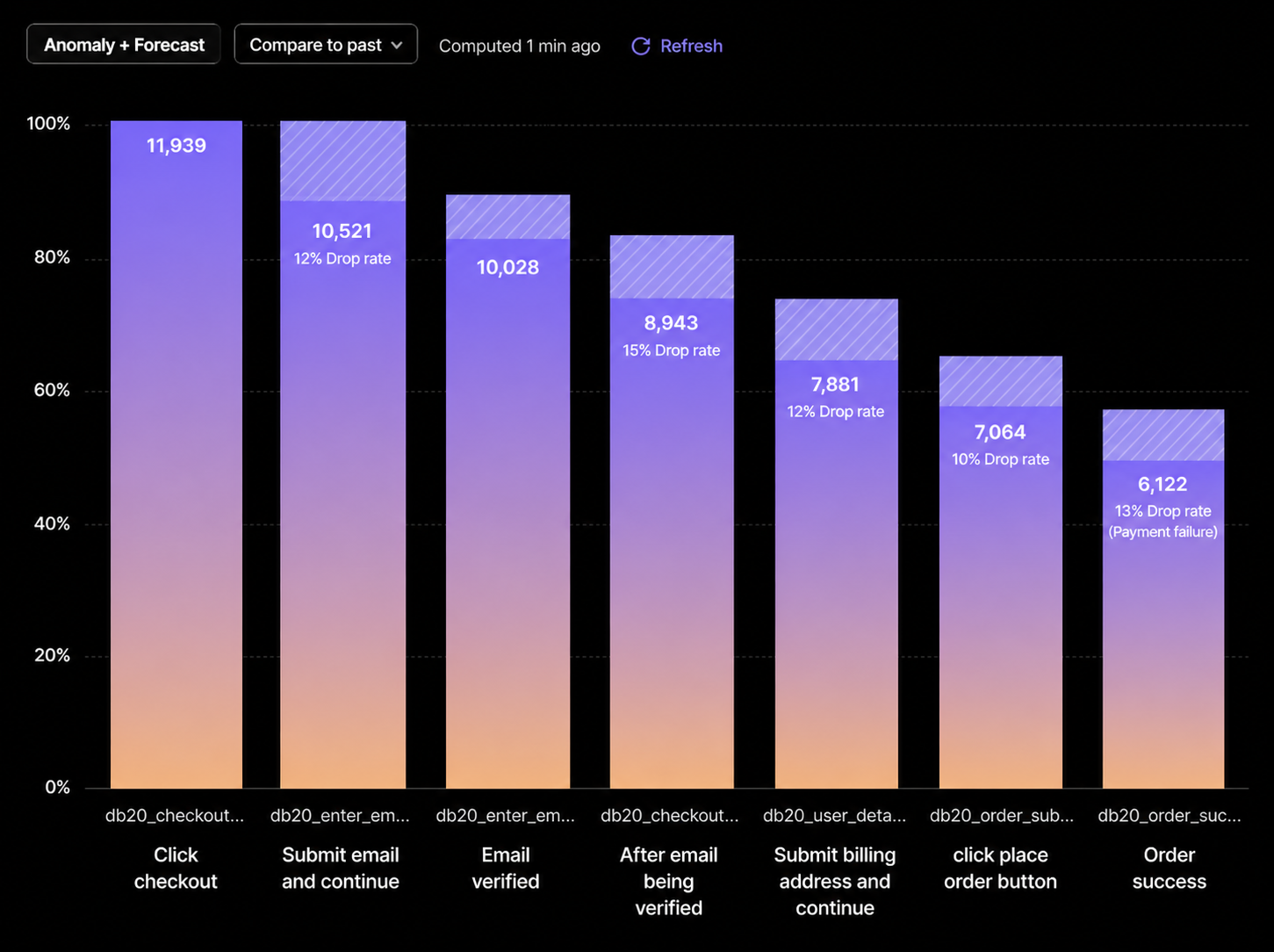
11.6%
failure rate across checkout steps.
83%
of users on Windows couldn't use Apple Pay, the only express payment option.

13–22
clicks for users to complete checkout.
“An ideal checkout flow can be as short as 12-14 form elements (7-8 if only counting the form filed).”
— Baymard Institute research team
Scrolling Issue
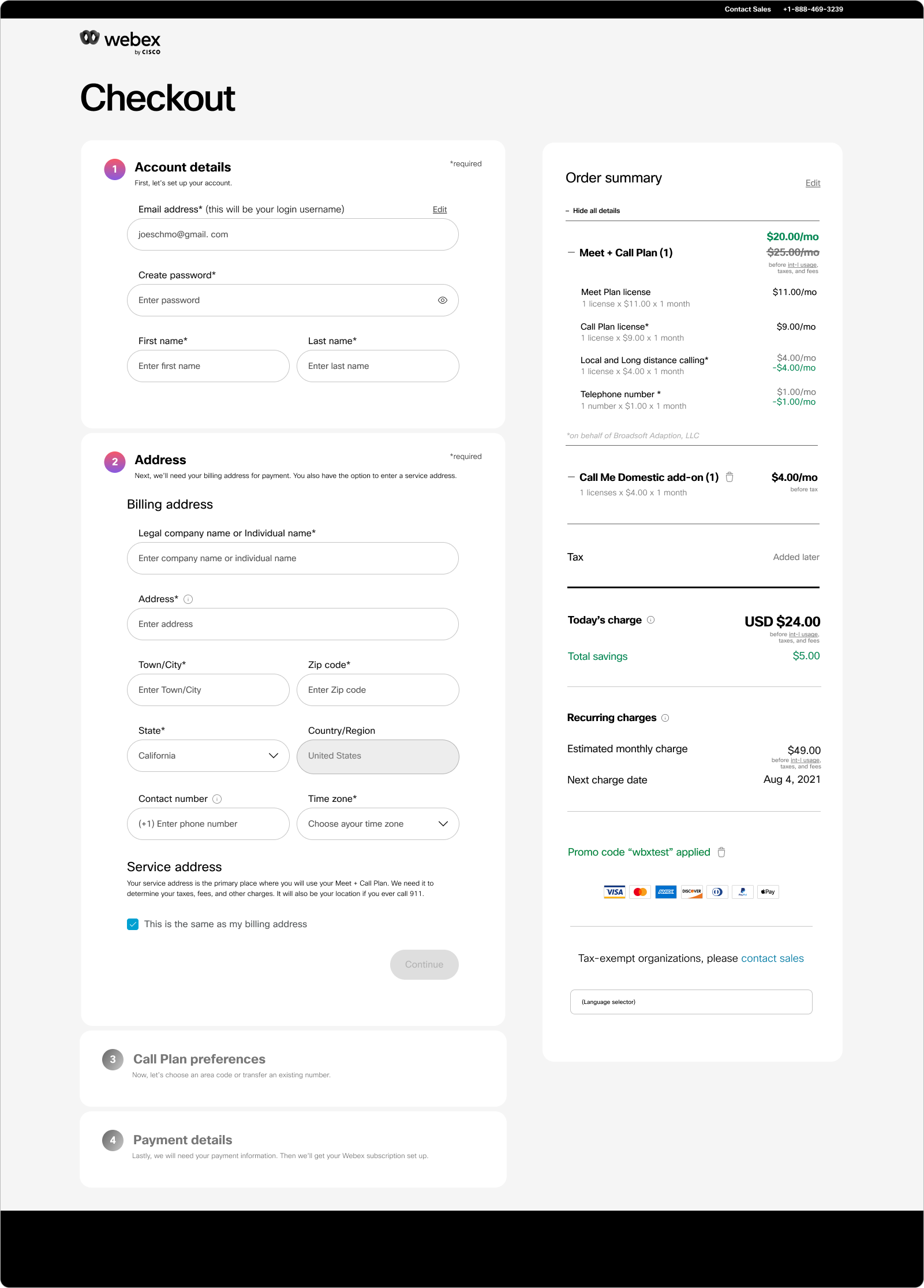
One view combined account creation + billing — causing scroll fatigue & errors.
Problem Statement
The checkout experience was not just a UX issue, but a revenue inefficiency problem.
With an average drop-off rate of 11.8% at each step, the compounded loss significantly reduced overall conversion, directly impacting SMB acquisition and revenue growth.

Business goal
Reduce checkout friction and improve conversion rate through design optimizations that minimize engineering lift, leveraging the existing backend architecture wherever possible.

Target audiences
While our primary focus is on individual users purchasing our service, it is important for us to also consider and prioritize the user experience of enterprise users. Since those users can also utilize this flow.

Competitive Research
In addition to analyzing internal checkout flow data to identify current pain points, I conducted a comprehensive competitor analysis. This analysis served as valuable design support and provided useful references, allowing me to gain insights into the average users' expectations of online checkout experiences.
Findings
The competitive landscape shows that multi-step, input-heavy checkouts are standard, reflecting systemic constraints rather than optimized experiences. This creates an opportunity to reduce perceived friction without reworking the a by focusing on cognitive load reduction through progressive disclosure, smart defaults, and input automation, making the flow feel faster and more intuitive.
Solutions & Proposals
I broke down the checkout funnel to identify where the most critical drop-offs occurred and prioritized optimizations based on impact potential.
Primary metric: Checkout conversion rate
Secondary metrics: Step completion rate, time to complete
Constraints: Fraud risk, legal compliance requirements
This framework ensured that design decisions were aligned with both growth and risk management goals.
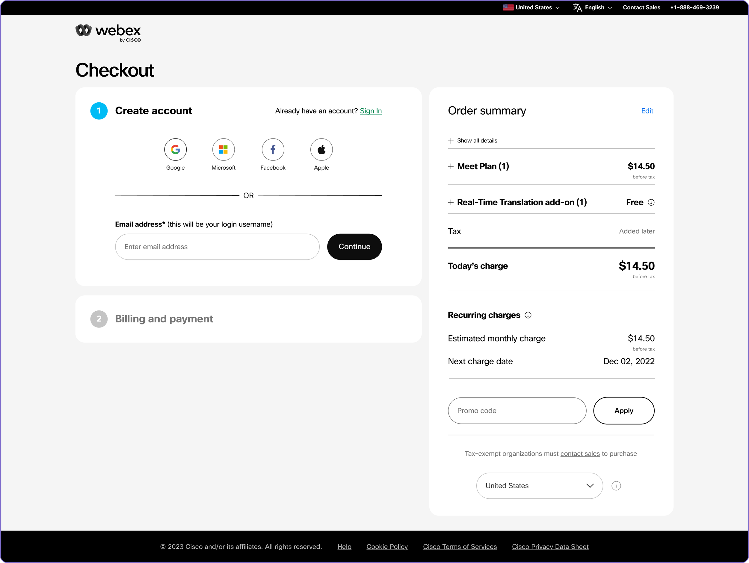
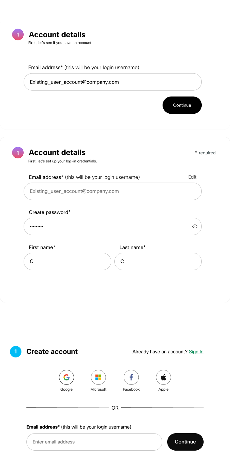
Add social sign-up options to accelerate account creation.
01
Reduce friction by letting users register with existing social credentials (Google, Apple, Facebook, etc.), lowering drop-off during sign-up.
Shorten time-to-first-value: fewer fields, automatic profile data population (name, email, avatar) speeds onboarding.
Improve form completion rates and conversion tracking through fewer steps and clearer success signals.
Reducing cognitive load by simplifying input requirements and improving form clarity
02
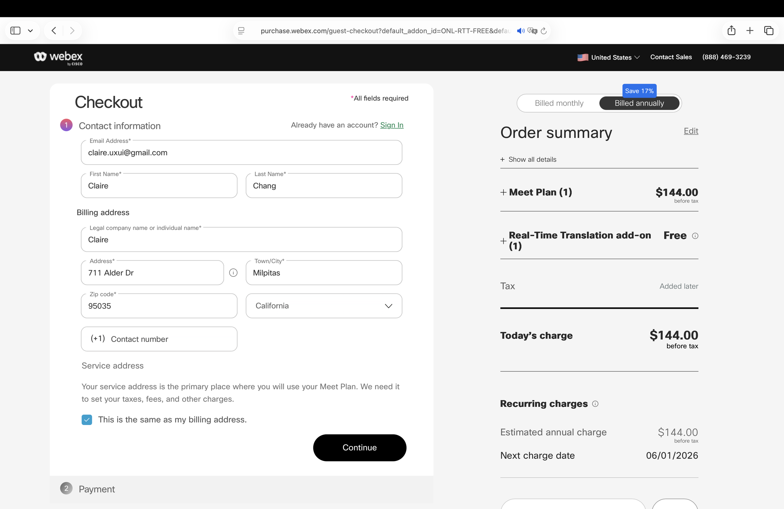
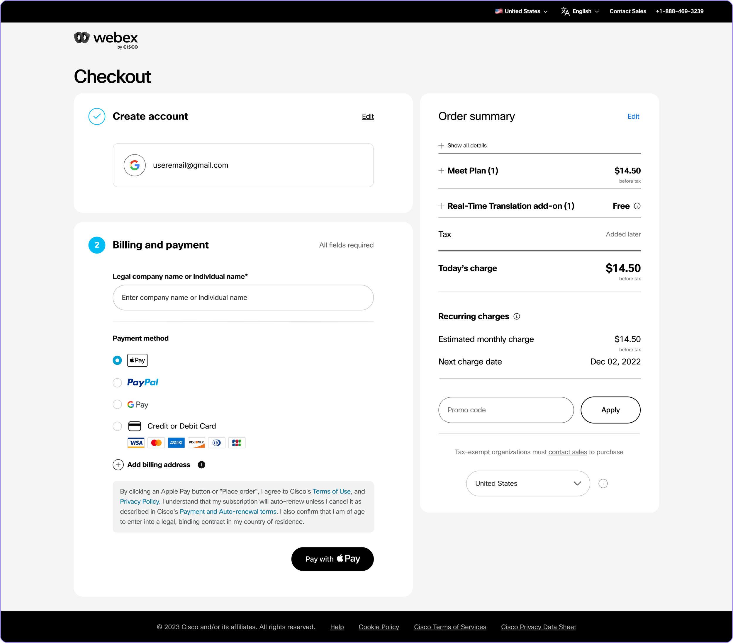
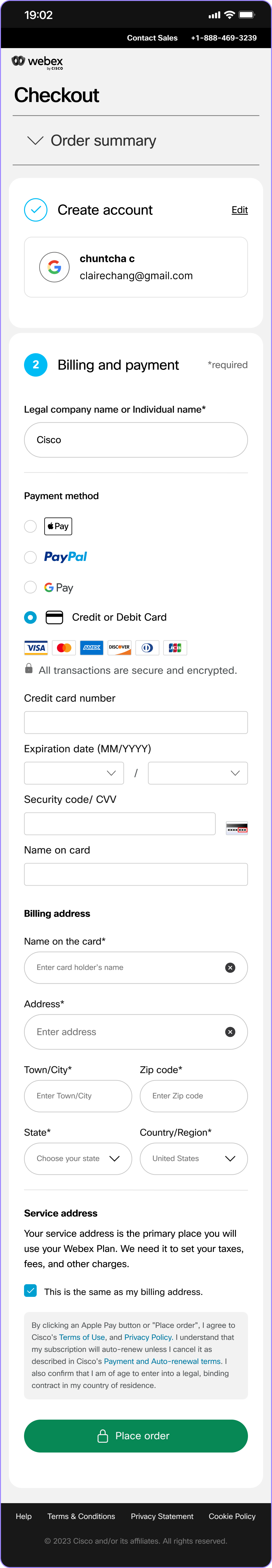
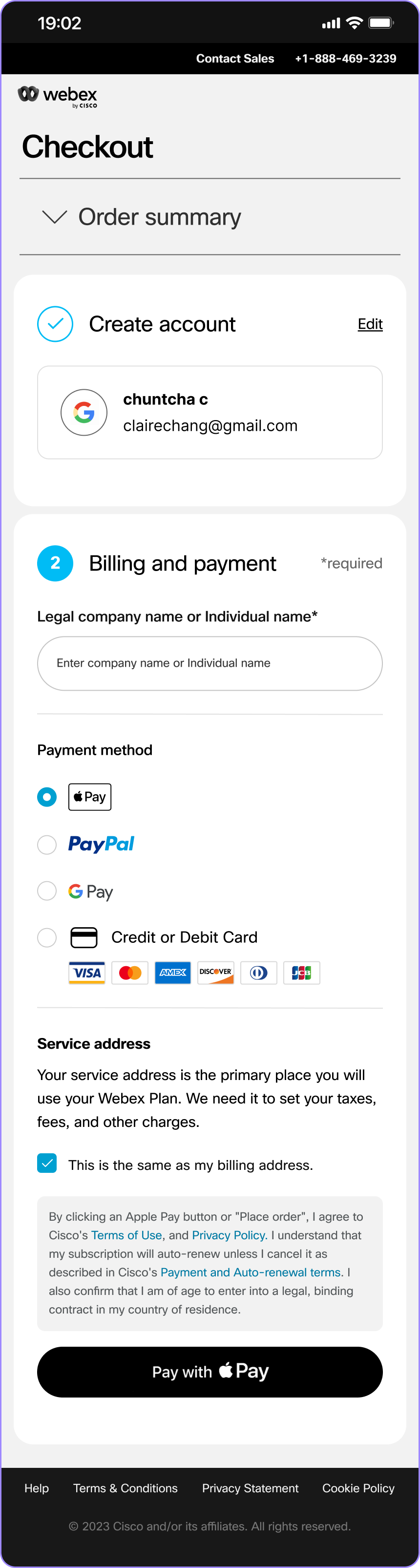
The current flow merges account creation and billing details into a single step, increasing perceived input complexity and making it harder for users to review and catch errors.
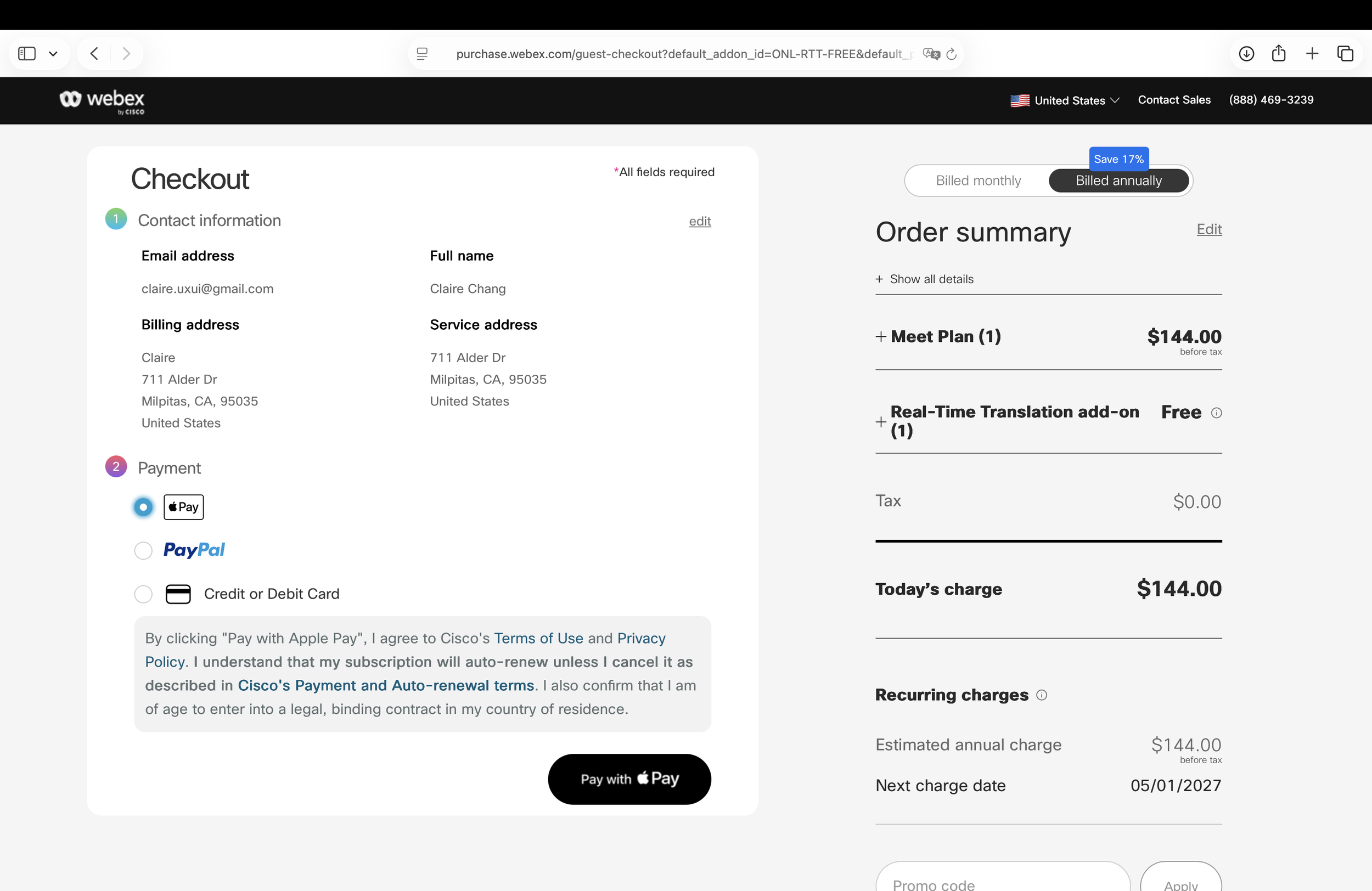
Expand third party payment options for Windows users and standardize the interaction pattern
03
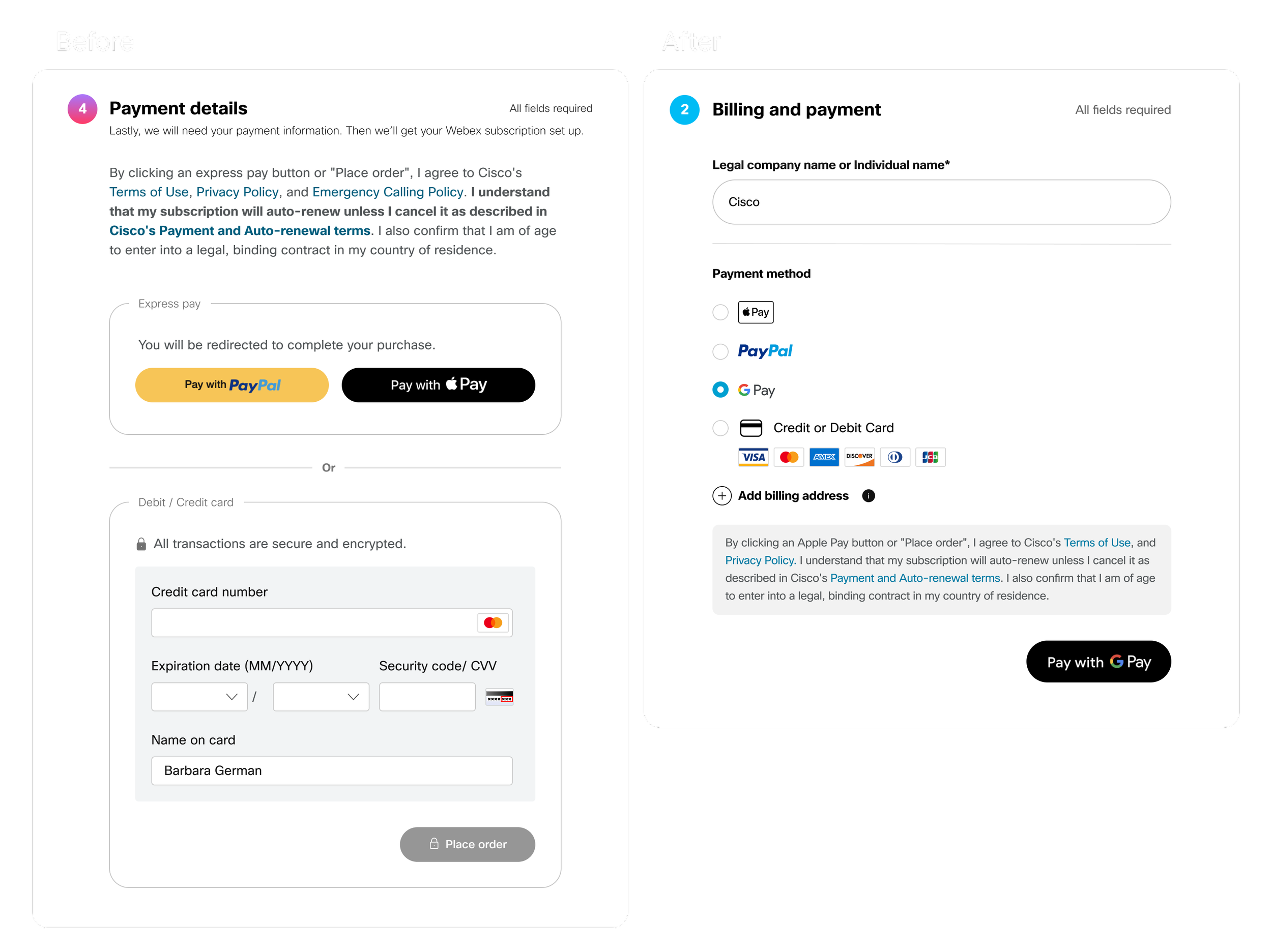
Expanding the payment options, I restructured the layout and components to improve visibility and create a cleaner, more cohesive experience.
Streamlining the flow to minimize unnecessary steps and redundancy
04
With social sign up and third party payment options, user details such as name and billing address can be reused, eliminating redundant inputs. Users retain full control to edit this information during or after checkout if needed.
North Star
13 steps → 5 · 9 fields → 1
The redesigned checkout flow reduces the minimum steps from 13 to 5 and cuts required inputs from 9 to 1. To further lower friction, we introduced Google Pay as an additional payment option. These changes position us to improve conversion from 65% to a targeted 80% post launch.
Challenges
Third-party CTA constraints

Payment providers require their own button specs — I designed a layout accommodating provider requirements while maintaining visual coherence.
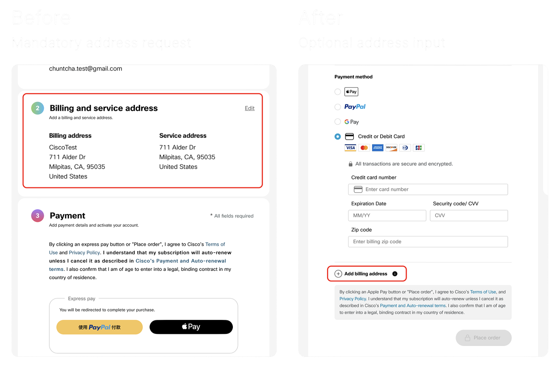
Financial & legal approval

A key challenge was whether to remove the billing address step, a major friction point. While data suggested conversion gains, legal and risk concerns around fraud and compliance prevented its removal.
I partnered with cross-functional teams to retain the requirement while reducing friction through better form design, autofill, and clearer guidance.
This balanced conversion improvement with risk mitigation.
Outcome
Over 6 months of launch, the new checkout experience improved conversion by 10%.
More importantly, the project revealed that users were less driven by express checkout options than initially assumed, and more sensitive to pricing clarity and plan visibility.
This insight informed the next phase of work, shifting focus toward improving the cart and pricing experience.