2019 ・School project・ UX design + Visual design
iCloth App Design
Project Concept
What does this app do?
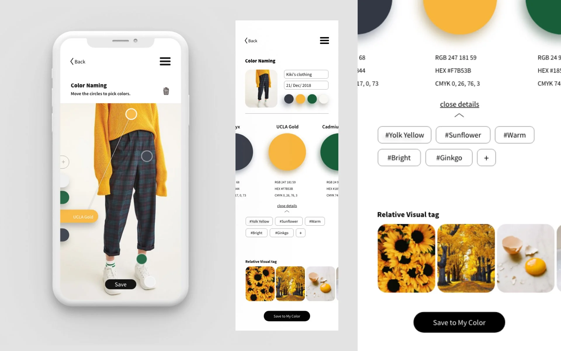
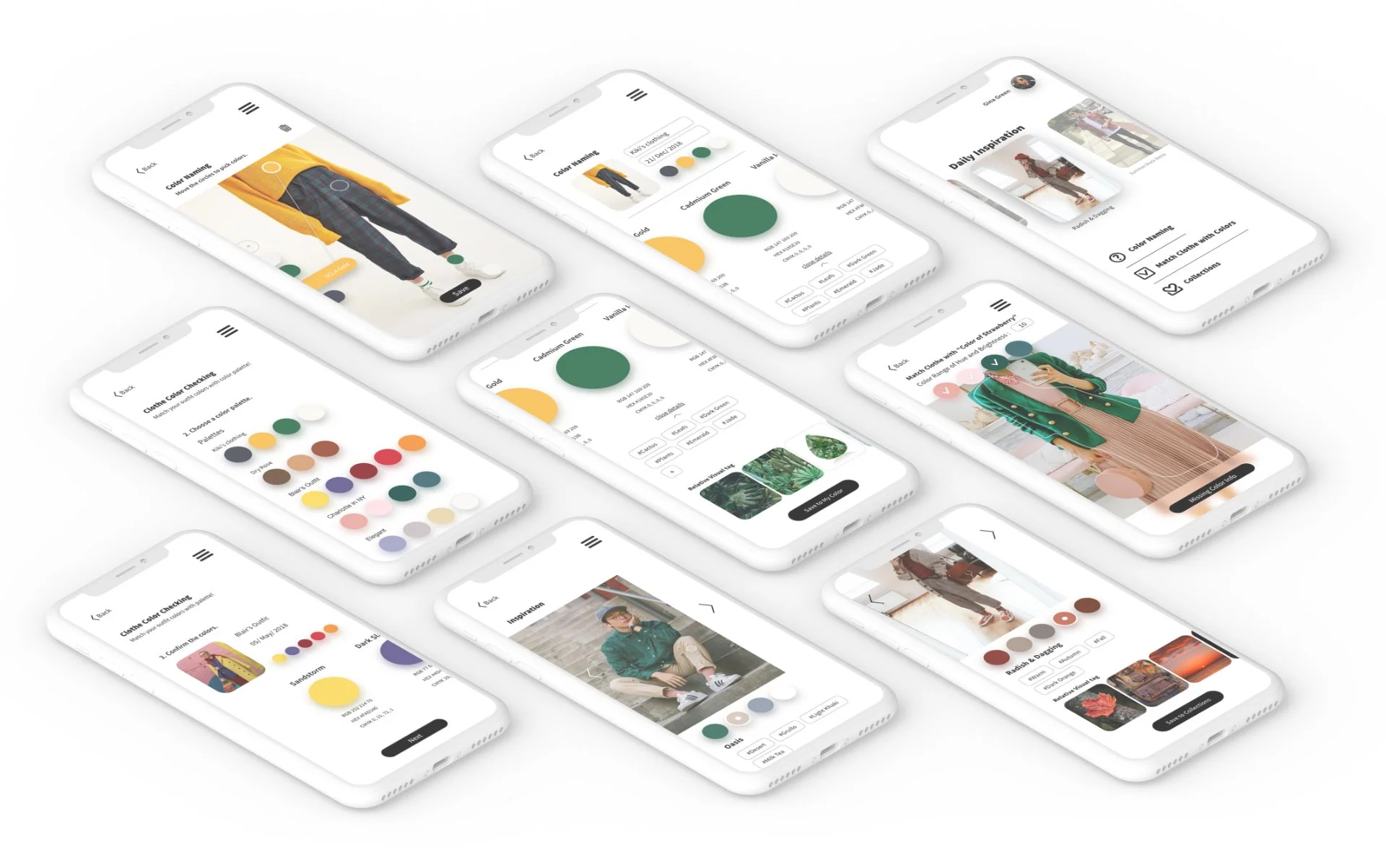
iCloth is an outfit’s color inspiration app for color blindness. Through this app, I hope it can improve the lifestyle for colorblind people that allows them to wear as colorful as they want.
Why I designed it?
Colors play a vital role in design, as they evoke emotions and sensations. Using inappropriate colors in a design can lead to confusion for the audience. In today's pop-culture-driven world, colors are becoming increasingly significant, with Pantone selecting an annual representative color based on people's preferences, each constellation having its lucky color every month, and even K-pop idols adopting their own representative colors.
However, amidst this color-centric society, we must not forget that there are individuals living in a color-chaotic world. Although they cannot perceive colors, they still deserve to experience the vibrancy of this colorful world. In response to this, I have decided to design an app that allows them to embrace colors in their own unique way.
Research & Data
Pain Points
People with color blindness aren’t able to identify colors precisely. Especially when it comes for green and red colors.
Colorblind people have difficulty to match their outfit by colors.
It’s hard for colorblind people to buy clothes by colors.
Some colorful and vibrant color design app is hard to operate for colorblind people.
It is difficult for colorblind people to distinguish bad and good quality of food by their colors.
Colorblind people are afraid of talking about colors with others.
Solutions
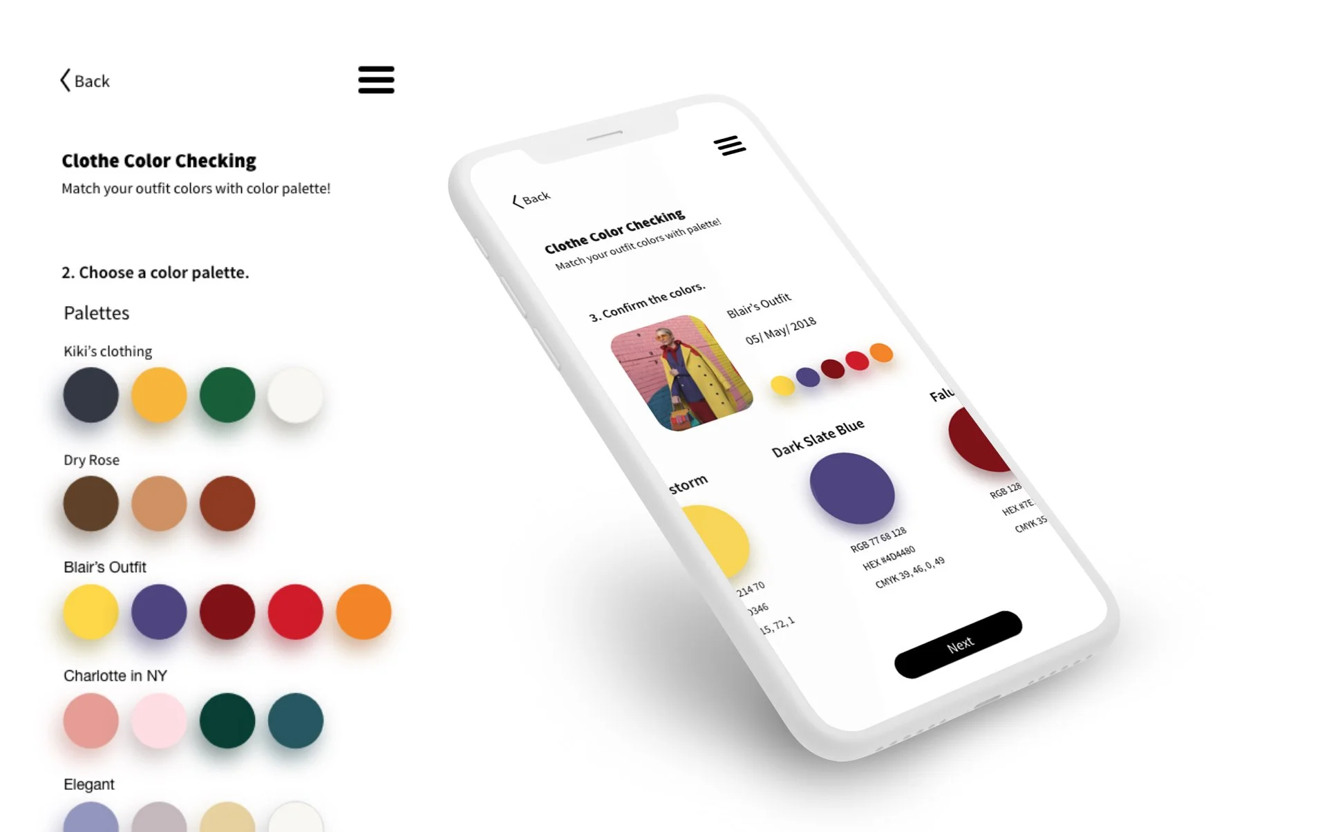
An app helps people with color vision deficiency problem to match their outfits.
Offer a platform for colorblind people to share their wearing methods or style.
Right now most of the color blindness apps are for naming colors or compensating colors. (Color compensation is for color weakness people not total colorblind people.)
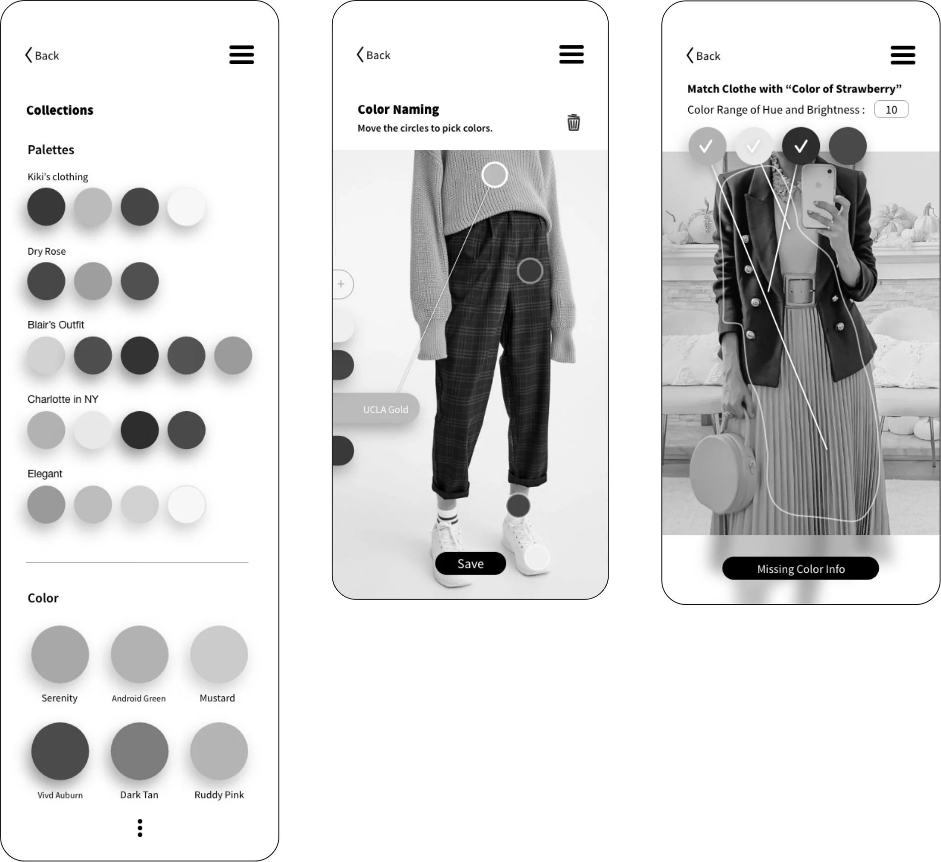
Wireframes
Visual Guideline
Main Task Flows
Color Vision Testing
Overall thought
Colorblindness encompasses various types, each with its own set of colors that are affected. Designers often overlook considering the accessibility of colorblind individuals during the design process. However, through this project, I have gained valuable insights on creating colorblindness-friendly UI designs by avoiding color combinations that may hinder their experience. Moving forward, I will prioritize the usage of colors that cater to colorblind users when designing. I firmly believe that a successful UX design should be accessible to everyone, including those with colorblindness.
All UX Projects

