
2023 ・UX design + Visual design
Webex Sign-on Revamp
“I redesigned the sign-in/up flow for individual online users to easily onboard to Webex.”
Catalog
Solutions & Proposals
Challenges
Result impact
Why
Business goal
Target audiences
Why do we need this revamp?

A lengthy sign-up process adds friction and can greatly impact conversion rates. We're aiming to streamline the sign-on flow, making it shorter and more intuitive to boost conversions.
Business goal
“Our goal is to streamline the free sign-up process, reducing friction points and boosting the conversion rate.”
Target audiences
“While our primary focus is on individual users for website sign-on, it is important for us to also consider and prioritize the user experience (UX) of enterprise users.”
Solutions & Proposals
01
Remove unnecessary input requests
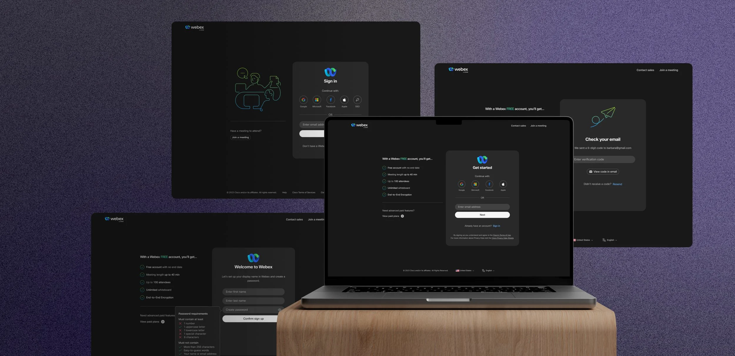
To simplify the flow, I proposed and received approval from the PM to streamline unnecessary inputs in the sign-up process. For instance, I removed the optional phone number field, relocated the region drop-down to the footer, and combined the first name and last name inputs into a single display name input.
02
Divide the layout into 2 columns for flexible changes and updates
Organizing the content into two columns enables us to present more information on the page, which enhances users' motivation to sign up or utilize it for business purposes on the sign-in page. To prevent information overload, I designed the sign-on flow using colors and container shapes to prioritize key tasks. This approach helps users easily focus on the main sign-on task flow.
03
Provide more social sign-on options to reduce frictions
Social sign-ons are indeed the quickest option for new user sign-ups. However, this approach may result in missing essential user information. To address this, I've discussed with the PM the possibility of either ignoring the missing details or collecting them later through separate tasks. I'm pleased to share that I've received the green-light to integrate social sign-on options into our sign-up flow.

04
Cover the use cases as much as possible
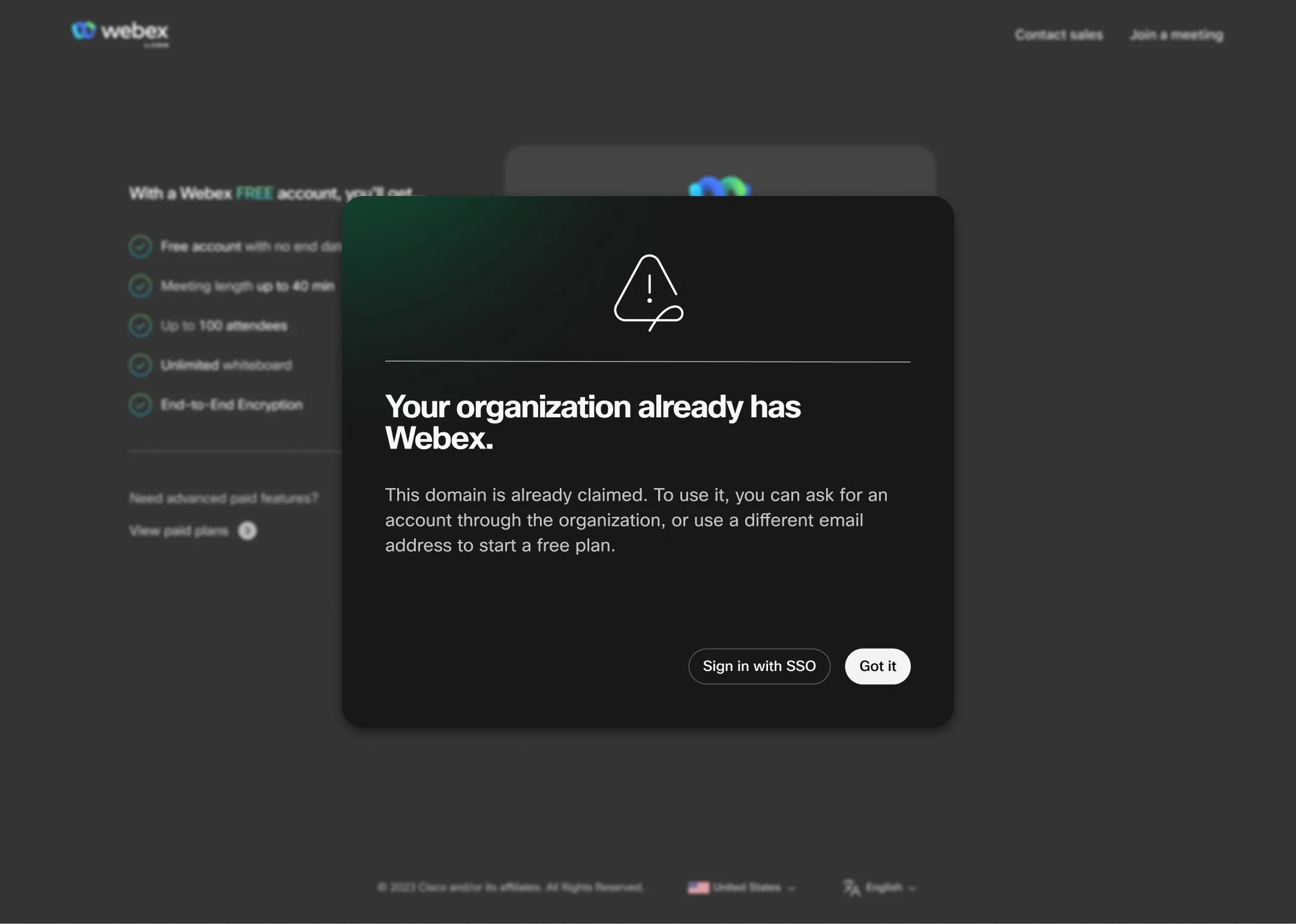
To ensure a seamless user experience during the Webex account sign-in process, I maintained regular communication with the PM and engineers. This collaborative effort was aimed at ensuring my design catered to a wide range of use cases. For instance, I addressed queries like guiding existing users during re-sign-up, providing information for new users on the sign-in page, and offering guidance to users whose sign-up domain has been claimed by an organization.

Data Support
To support the proposal design, I conducted thorough research and gathered references from various platforms with similar features, including Zoom, Microsoft Teams, Google, DropBox, Miro, and JIRA.
Challenges
during the process
Tech side:
Implementing support for social sign-on requires addressing various cross-scenario situations. For instance, we need to provide clear and understandable alerts when users who signed up with an email and password attempt to log in through a social sign-on entry point. It took time to invest in designing the best user experience (UX) for these scenarios, referencing other successful implementations. Additionally, we spent additional time collaborating with the engineering team to determine what is currently achievable for us.
Different opinions from the leadership:
Sign-in and sign-up experiences are common in everyday life, and everyone has their unique perspectives on the best user experience (UX) for these flows and designs. Reaching a final decision that satisfied most stakeholders required a significant effort. We gathered a wealth of reference data to support and convince others of the chosen design by looking up multiple platforms and conducting user testings.

Final Results
With the approval of the VP leader, our team will proceed to implement this new sign-on design across various portals and applications. This ensures a consistent and unified sign-on experience across different products.
Future iteration plan
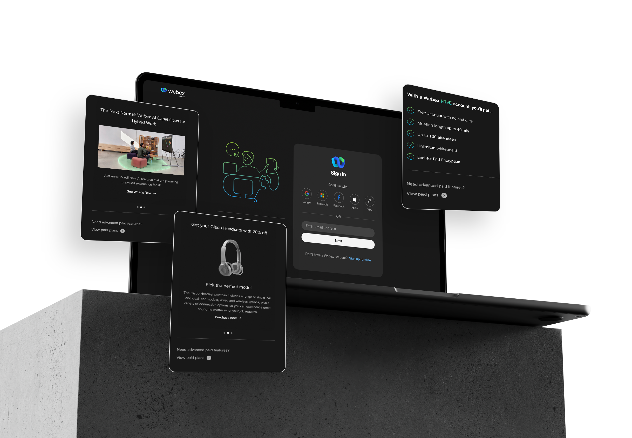
Utilize the left-hand side for marketing purpose to advance the users and community.
To enhance the business impact on the sign-in page, I created several advertisement components to be placed on the left-hand side of the page as per requirements. These advertisements aim to strengthen the connection between individual users and the community, while also offering improved visibility for seasonal promotional sales.